Nothing started with a layout.
We began with a long questionnaire: who refers to Headstart, who self-refers, what each of them worries about, and what the one action on every page should be. The answer was clear. Book a call or send a referral, and make both feel easy for a parent at midnight or a coordinator between meetings.
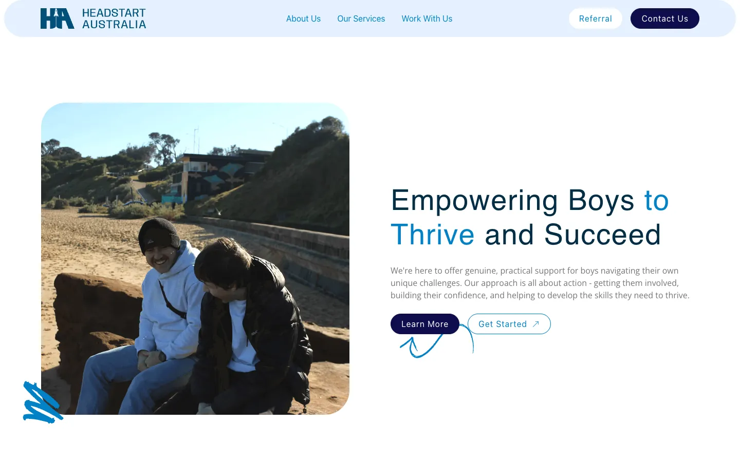
From there we set the brand direction for the site, built around Headstart's own mark: a navy and bright blue palette, and Satoshi and Mukta for a voice that's friendly without being young. Then the site map, so services and programs had somewhere to live and grow, and a section-by-section plan of the home page that put proof before promises.
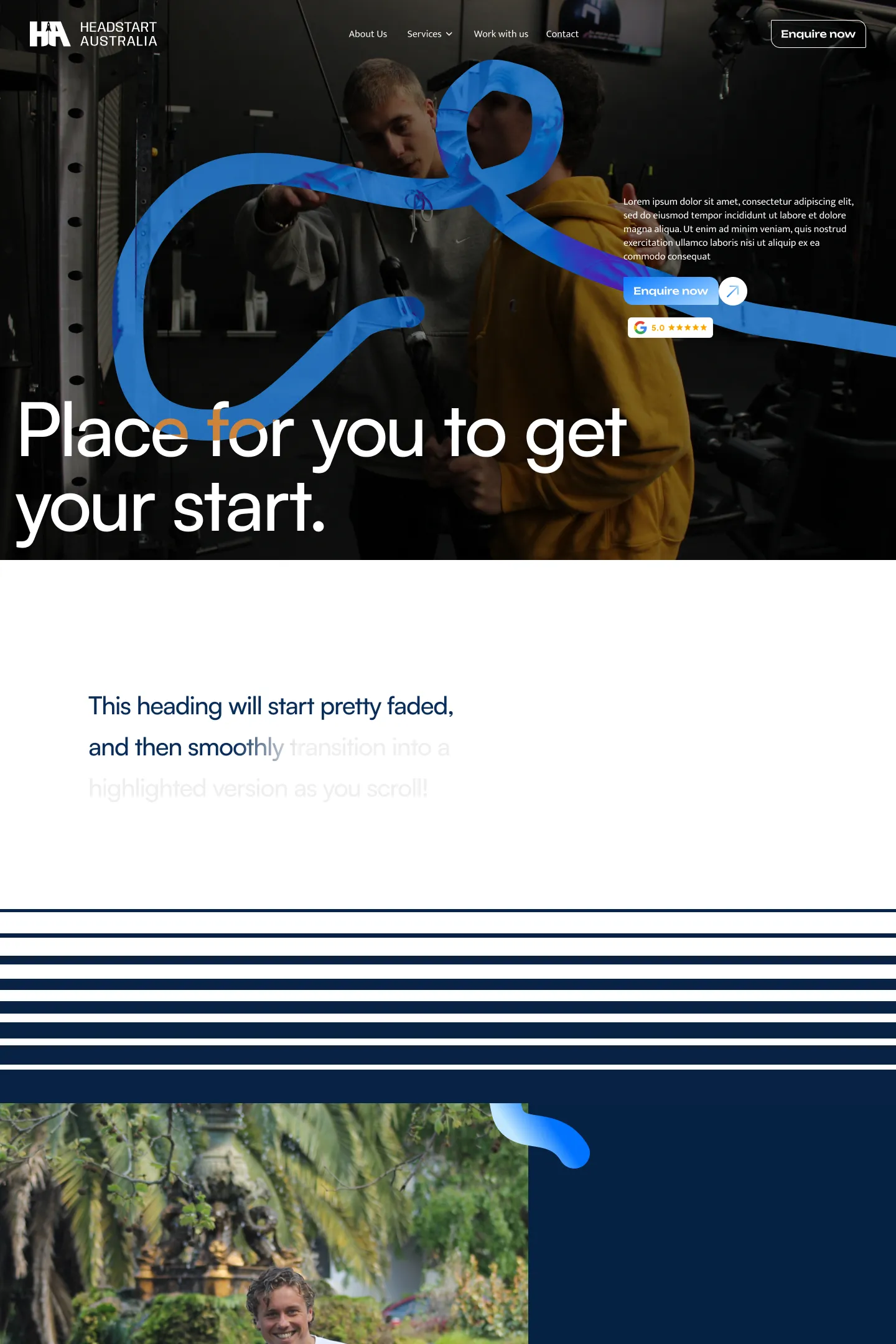
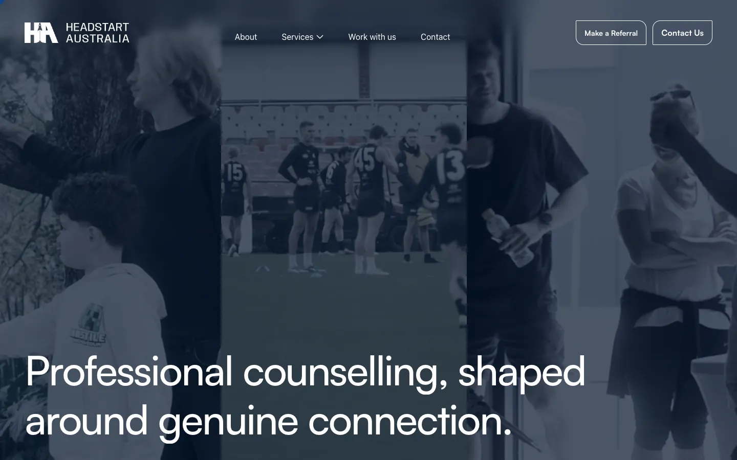
The build went into Webflow, so Headstart's team can keep editing it, with custom GSAP motion, smooth scrolling and page transitions layered on top to give it a premium feel.